
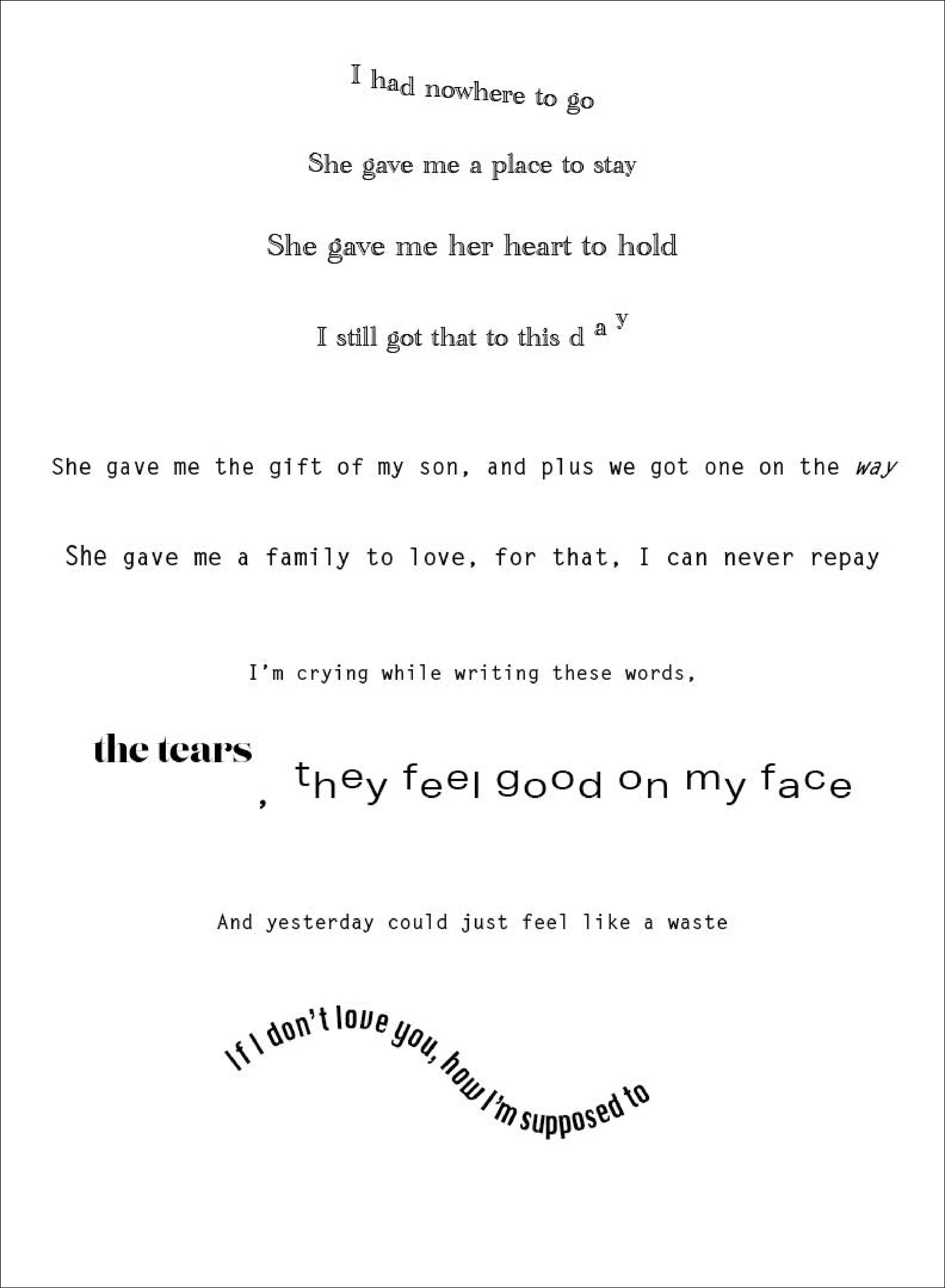
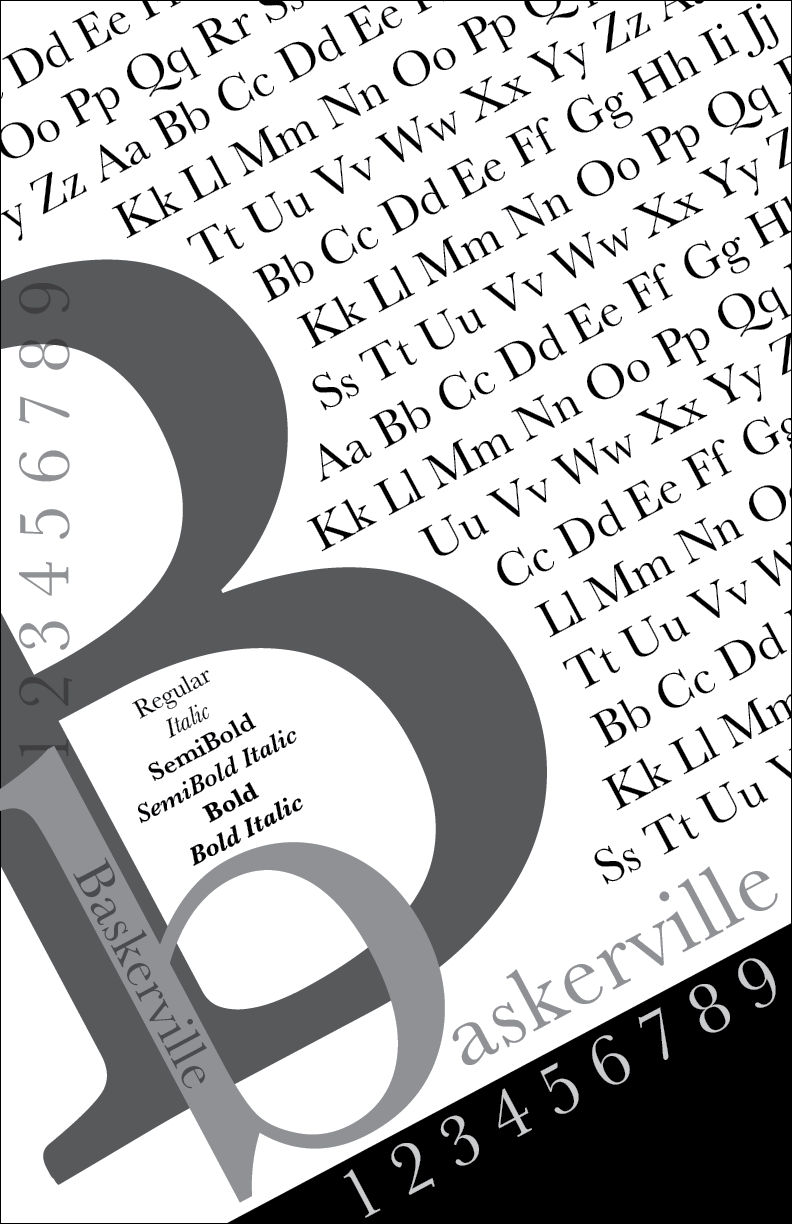
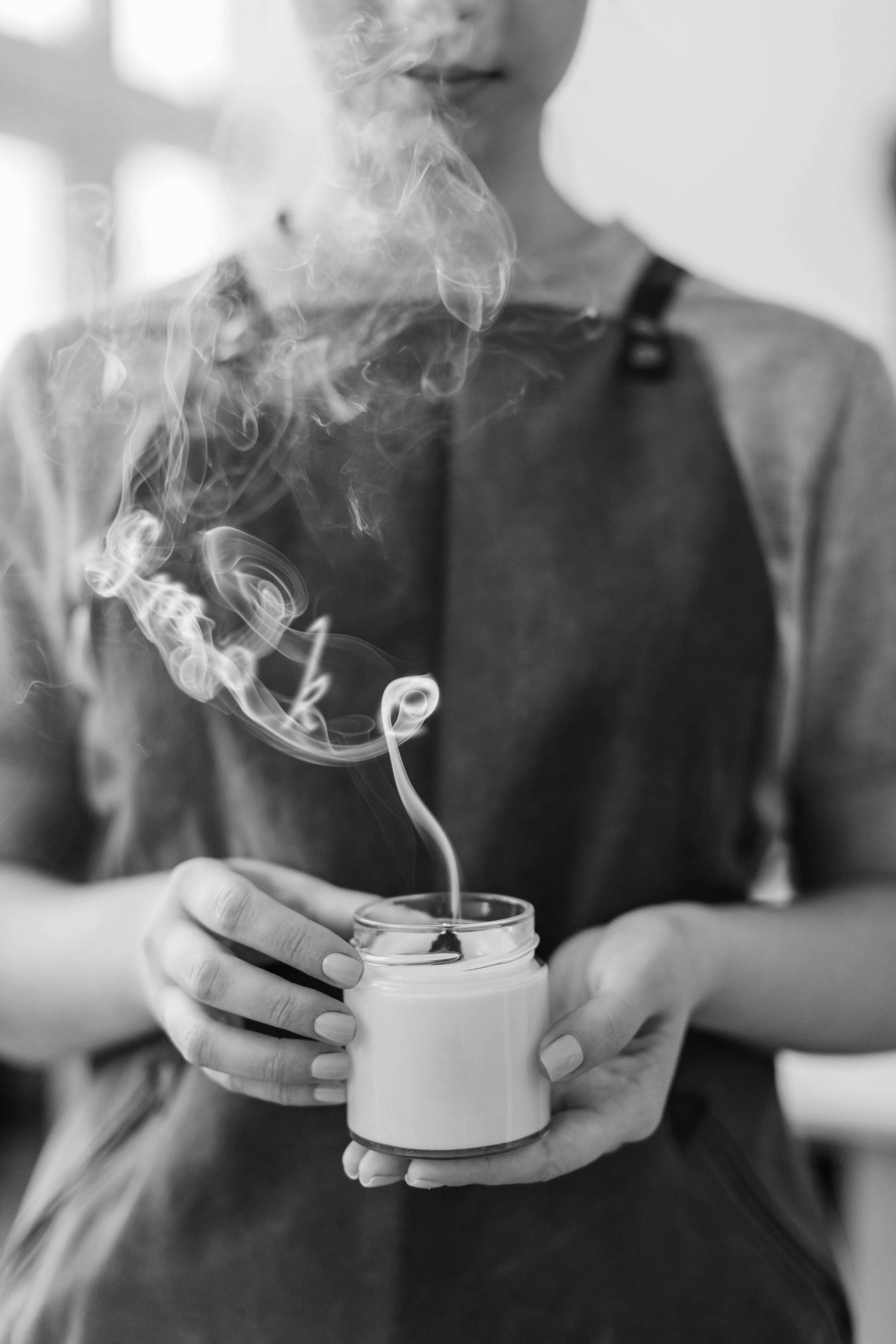
These projects focused on using typography to create a composition or incorporate it into an image. The project on the left side is a verse from a song, and the goal was to make the typeface move in the way we heard the song play out. The middle project uses the typeface Baskerville, and the idea was to play around with layout and see how we would arrange the alphabet and numbers. In the final project, we had to edit a word into an image and make it seem like it belonged there. This involved choosing the proper typeface and using Photoshop.